Browsing on the Blackberry (and other non iphones)
- Apr 22, 2009
- 2 min read
I'm interested in exploring custom CSS that takes what looks normal on a desktop and modifies it in favour of usability on a mobile device. I think I have to add the caveat that I'm only talking about non-iphones, as I understand that the iphone renders pages much like a desktop does, and then you just zoom around. That's not what I'm talking about, since not everyone has an iphone, and Blackberries are far more prevalent in the business world.
Using a utility called JL_Cmder I was able to take some screen shots of various sites on my Blackberry Curve 8310. What I noticed was that depending on the effort, the result was very different. I also noticed that images, Favicons, text size and form field entries all factor into the design.
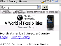
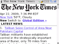
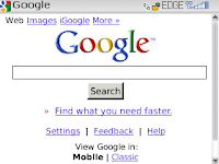
The first example is airmiles.ca . I'm a little biased, because I know what the infrastructure is behind the Air Miles website and I know that there are changes in the pipeline that just haven't come to fruition yet. For that reason it's a great example: The "You need Flash" message doesn't appear on many other sites I tried. The images aren't optimized for mobile. There is no browser sniffing determining a custom CSS. There is no favicon visible. Scrolling down a little, the experience get's better with text versions of a java menu that makes navigation very easy.You would assume that RIM would make the Blackberry site the absolute best possible experience via a mobile device, but alas, this is not the case: Not bad as far as images, buttons, etc still being readable. No Favicon. Text size seems oddly large compared with the size of the image text within the buttons and graphic assets.The New York Times does a good job. Not sure if Blackberry can display transparency in a Favicon, but not a big deal. The masthead image in the top takes up a lot of room for a content based site, but as I explore further down, the stories are structured in an extremely navigable fashion and the text size is good.Google knocks it out of the park with their mobile site. Clearly a site designed specifically for a small screen, even showing the option at the bottom (of a single screen mind you) to switch to a 'classic' mode. The favicon is clear and adds just enough brand to the screen. Top nav links are shortened. Site is simple and delivers exactly what you visit for.I'm not sure that this kind of multi-platform, multi-screen-size, multi-browser thinking is quite feasible yet for joe-website designer, but certainly as big brands reach out into the mobile world and engage their own consumers in new ways, they will need to think about how their brand is presented.A while back I explored a similar CSS hack for geo-targeting that allowed Perez Hilton to change his page background to a Canada-centric background image and engage his Canadian readers that little bit more. Simple enough, but why isn't everyone doing it?


Comments