New Profile Designs for LinkedIn
- May 17, 2012
- 1 min read
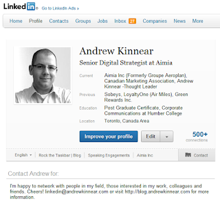
Not too shabby. I thought the site could use a refresh. I'm happy that the focus of a user profile is going the direction of 'the person' as opposed to 'the resume'. There's a much cleaner aesthetic to the design that I think many people will like.
The photo has been given more prominence, as has the number of connections someone has. It's annoying that the giant blue button for "improve your profile" still appears, even if the system says that you're at 100% completeness. Oh well...


Comments